Miks mobiilivaade määrab, kas klient võtab ühendust?
Try ordering food from your phone on a site where you have to zoom in to read the text, the buttons are smaller than your finger, and the screen jumps around when you fill in the form. You close the page and go elsewhere.
Today, over 70% of local service searches in Estonia come from mobile phones. If your site's mobile version is just a "shrunk-down desktop view," you're losing customers every single day.
The thumb rule
People hold their phone with one hand and navigate with their thumb. All the important elements — the menu, buttons, the call option — need to be in the thumb-friendly zone: the centre or lower part of the screen.
If your "Send enquiry" button is tucked in the top corner and tiny, the customer gives up before they even get there.
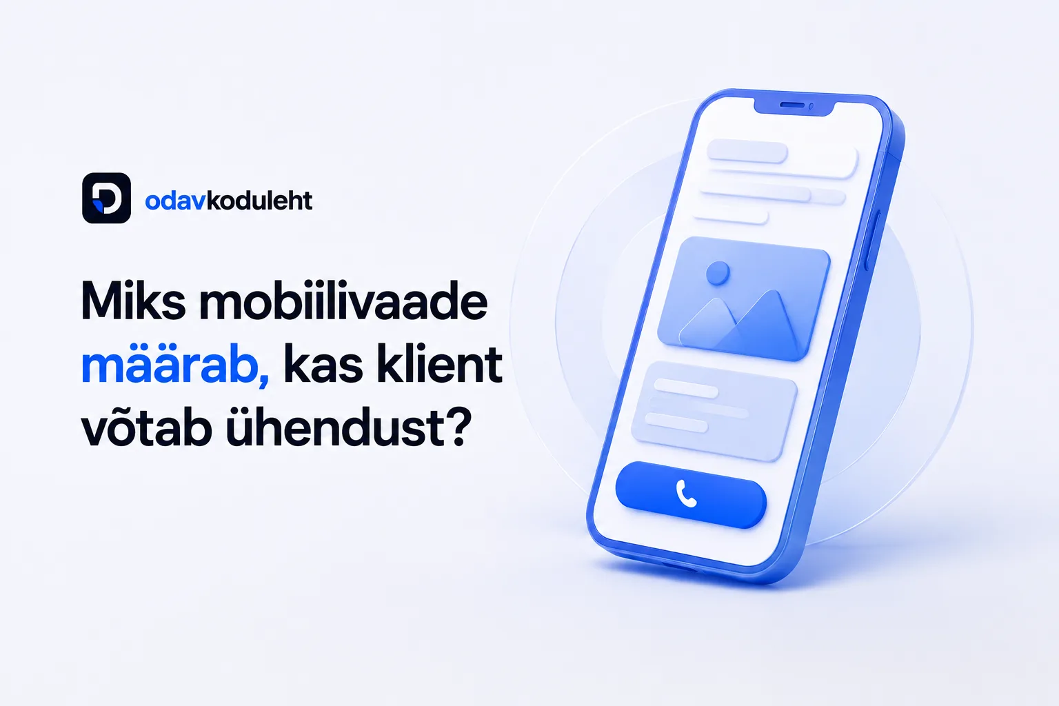
Your phone number must be clickable
This seems obvious, yet many sites still display the number as plain text or an image. A mobile user isn't going to copy it onto a piece of paper.
The number needs to be a link. One tap and the phone rings.
Text must be readable without zooming
A dense wall of text on a phone screen feels like a brick. The solution:
- Font size of at least 16px
- Short paragraphs (2–3 sentences)
- Plenty of breathing room between lines
Do this test: open your current website on your phone and try to submit an enquiry while walking. If it's frustrating or requires pinpoint accuracy, it's time for a redesign.
Mobile first
We start designing every new site from the mobile view. The page loads fast even on a weak connection, forms fill in smoothly, and navigation is intuitive. The result: customers find the information they need and get in touch effortlessly.